Fido Money Lending
Fido is a micro-loan company based in Ghana whose model is based on accepting and processing loan requests through their own mobile application. The goal was to increase the speed and completion rate of the process by improving usability, taking low-literate users and those unused to using a smartphone into consideration.
Client
Fido Money Lending
Role
Team Lead, UX/UI Design
Date
March 2016 – July 2016
Research & Testing
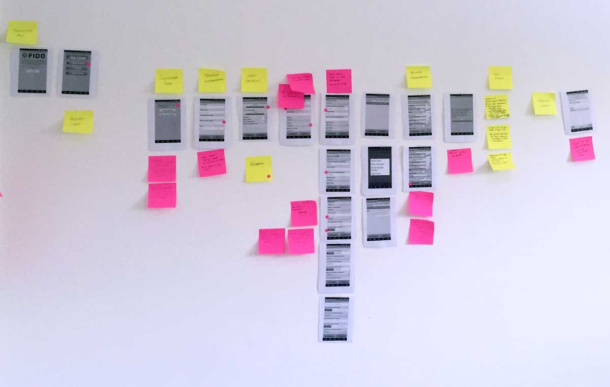
1Workshop
Of course, no one knew better than the existing Fido team what the biggest usability issues were with the app. We ran a workshop with them to identify those pain points and interviewed their customer service reps to find out what users most needed help with when they called in.
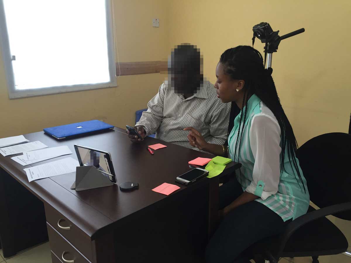
2Usability testing
We also watched new and old Fido users interact with the existing app to identify pain points and help re-map the user flows. We relied on guerrilla usabilty tests by the team (usually conducted on the streets around the office) to rapidly prototype and validate design concepts, and combined them with periodic testing at Fido’s offices at each phase of design.
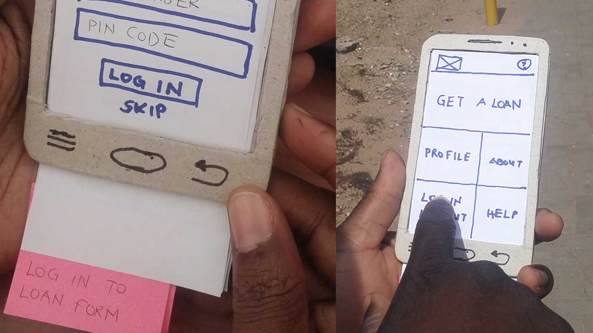
3Early paper prototype
Our process relied heavily on rapid prototyping. The team frequently validated new screens in minutes by testing with real potential users on the street. Early sketches were tested using paper and cardboard to quickly extrapolate an appropriate design direction. Higher fidelity prototypes were created and tested in Invision.
User Flows & Wireframes
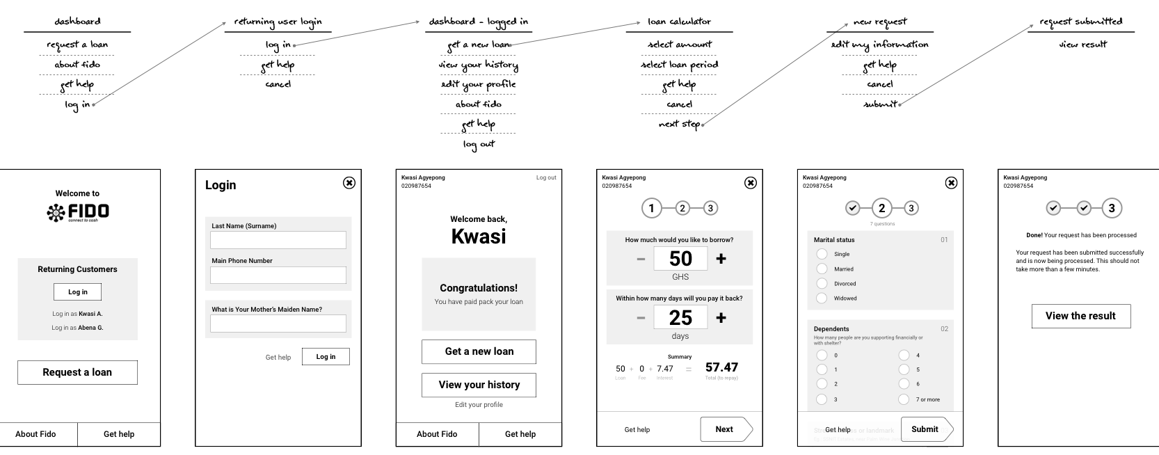
UI & Interaction Design
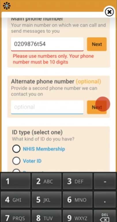
4Loan request form
Our interventions were both semantic — in the wording of the questions — and in the interaction design. For example, users had difficulty using dropdown menus which for gave little usability cues and hid the possible responses. They were replaced with radio button lists, which displayed the options upfront.
5Error handling
Reviewing and correcting errors proved to be major pain points. We broke the form into logical chunks and provided a review panel to allow users to review and correct their entries before proceeding to the next screen. Errors were clearly marked, and hyperlinked back to the relevant field to make it easier for users to find and correct it.
6‘Next’ button
Users who were not used to interacting with smartphones, rarely knew how to get the cursor to move to the next field whenever they were done filling one field. “Next” made it easier for them to do that. Users who were used to using a smartphone tended to conveniently ignore the “Next” button and scroll normally.